Trailer Titles
The Woman In Black (2012)
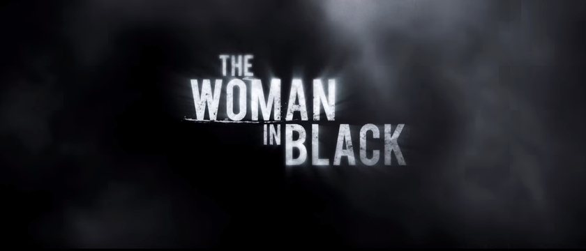
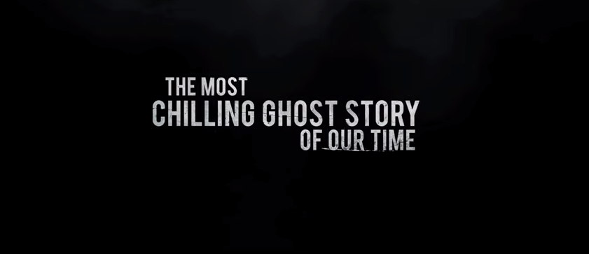
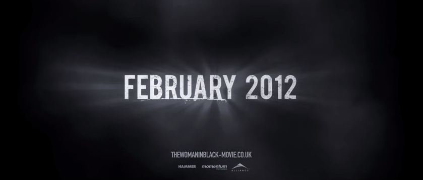
The Women in Black trailer is 1 minute 41 seconds long. The titles are pretty basic, but its the simplicity that scares the target audience. The titles have a black background to represent death and mourning but the white symbolises innocents and purity. The white is symbolic for the innocents of the child that died in the marsh and the children the Woman in Black have killed. The titles are clear and effective because they are white on a black background, this stands out to the audience and makes them scared because they have put a smoke overlay on it.
The Women in Black trailer is 1 minute 41 seconds long. The titles are pretty basic, but its the simplicity that scares the target audience. The titles have a black background to represent death and mourning but the white symbolises innocents and purity. The white is symbolic for the innocents of the child that died in the marsh and the children the Woman in Black have killed. The titles are clear and effective because they are white on a black background, this stands out to the audience and makes them scared because they have put a smoke overlay on it.
0:01
1:12
1:24
|
0:03

1:20
1:29
|
0:50

1:22
1:37
|
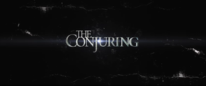
The Conjuring (2013)
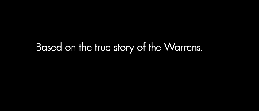
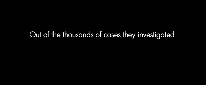
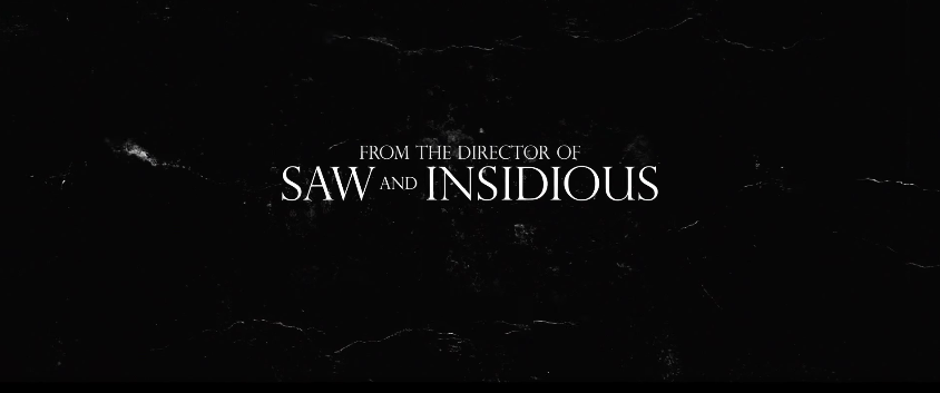
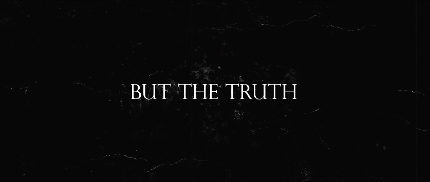
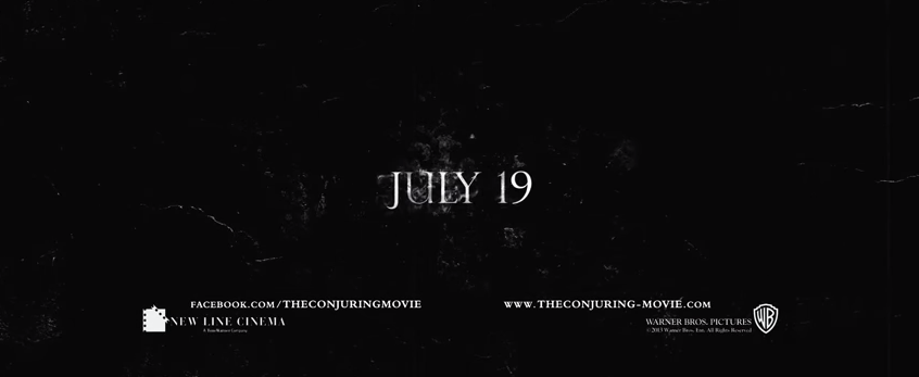
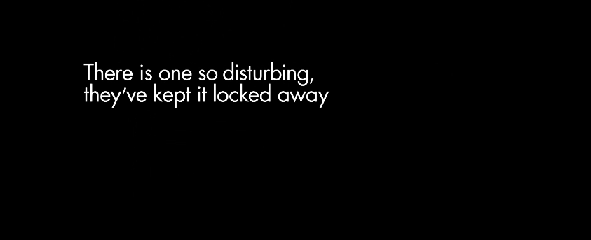
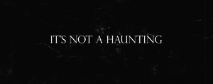
The Conjuring is 2 minutes and 28 seconds this trailer uses simple white text on a black background, this is effective because it makes the audience fear the unknown because of the black void that the text is put in front of. The font of the text also changes half way through when they introduce the slogan. At first the use a simple modern sans serif font font but then use a serif for to make it look a bit more sinister and mysterious. A good aspect of these titles are that you don't see the background change till the end title, it only changes slightly but its quite effective.
The Conjuring is 2 minutes and 28 seconds this trailer uses simple white text on a black background, this is effective because it makes the audience fear the unknown because of the black void that the text is put in front of. The font of the text also changes half way through when they introduce the slogan. At first the use a simple modern sans serif font font but then use a serif for to make it look a bit more sinister and mysterious. A good aspect of these titles are that you don't see the background change till the end title, it only changes slightly but its quite effective.
0:01
|
0:02
|
0:29
|
0:32
0:56
1:48
2:24
|
0:35
1:36
1:53
|
0:40
1:43
2:08
|
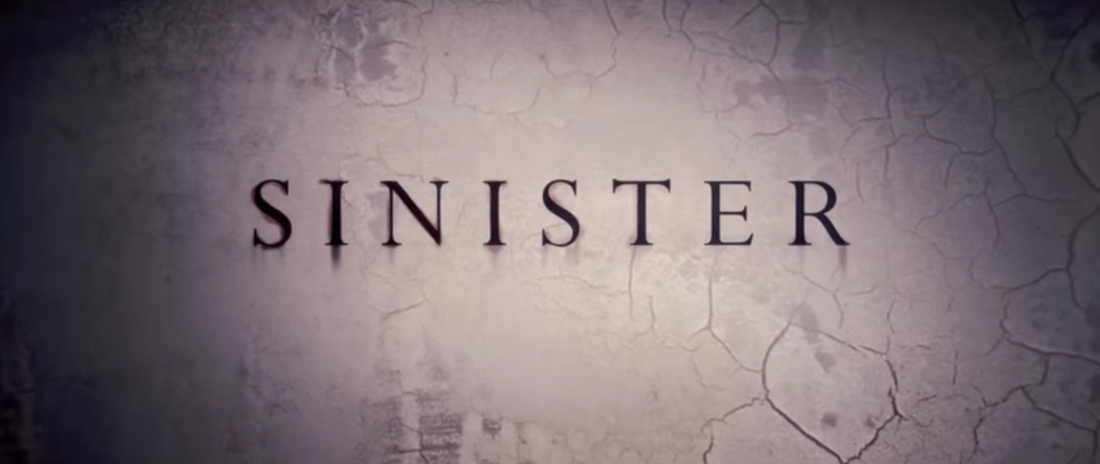
Sinister (2012)
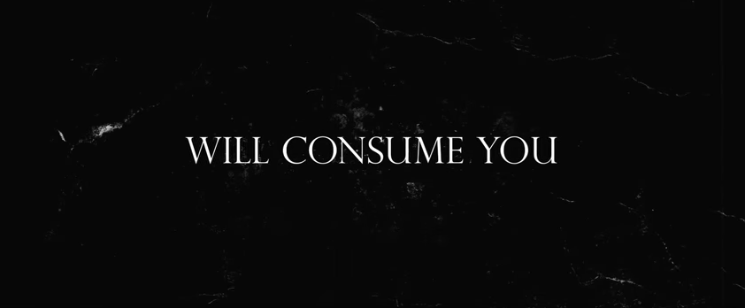
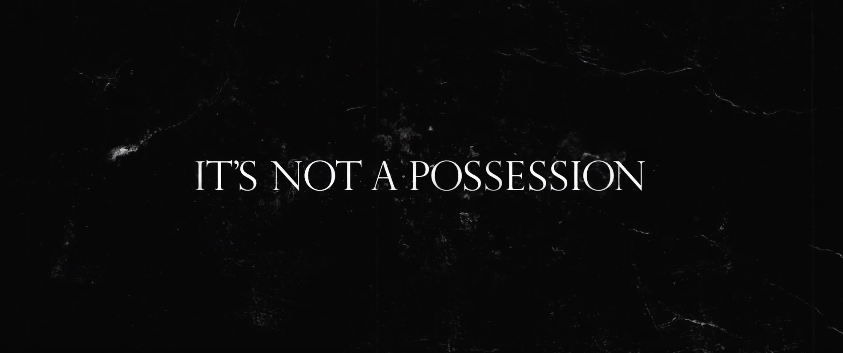
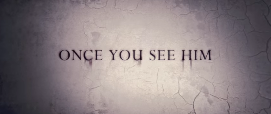
Sinister uses a whit pasty background with tinted black bits round the edges. The background also has cracks in which creep closer and closer to the middle as the trailer progresses. They use a serif font which looks like its runs down the wall. The shaded black edges create the feeling as if somethings being taken over or consumed, this makes the audience scared and fear what is going to come. The trailer is the same trough out but builds tension through the cracks and the darkness.
Sinister uses a whit pasty background with tinted black bits round the edges. The background also has cracks in which creep closer and closer to the middle as the trailer progresses. They use a serif font which looks like its runs down the wall. The shaded black edges create the feeling as if somethings being taken over or consumed, this makes the audience scared and fear what is going to come. The trailer is the same trough out but builds tension through the cracks and the darkness.
0:06
1:36
2:26
|
0:36
2:20
|
1:19
2:23
|
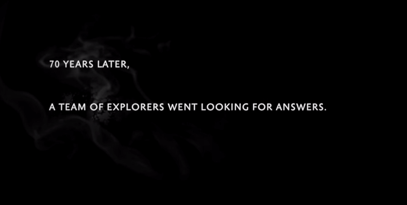
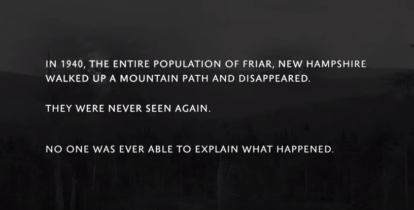
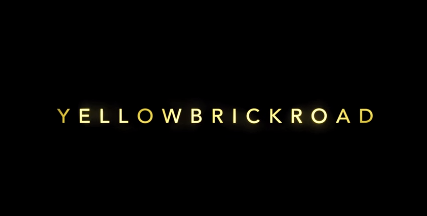
YellowBrickRoad (2011)
This trailer from the film YellowBrickRoad comes to 1 minute 52 Seconds. Unlike most trailers YellowBrickRoad starts off with titles instead of shots and dialogue to talk about the storyline. The first three pages of titles have a faded black and white picture of the town the film is based in. The writing is white, bold and in capitals this makes it stand out and is in contrast with the background. The next two pages it continues to talk about the storyline but the background changes to all black with white smoke on the left side of the page behind the writing. The writing is presented in all of these pages by fading in and then gradually coming towards us.
Two production companies are then shown on two different pages. Similar to the first five, the backgrounds are dull using the colours black and grey. The two pictures for the production companies include red this indicates death and blood. The last four title pages the writing has changed coloured to yellow this links in with the title.
1. 0.08
4. 0.25
7. 0.38
10. 1.38
|
2. 0.13
5. 0.28
8. 1.04
11. 1.41
|
3. 0.17
6. 0.32
9. 1.33
|
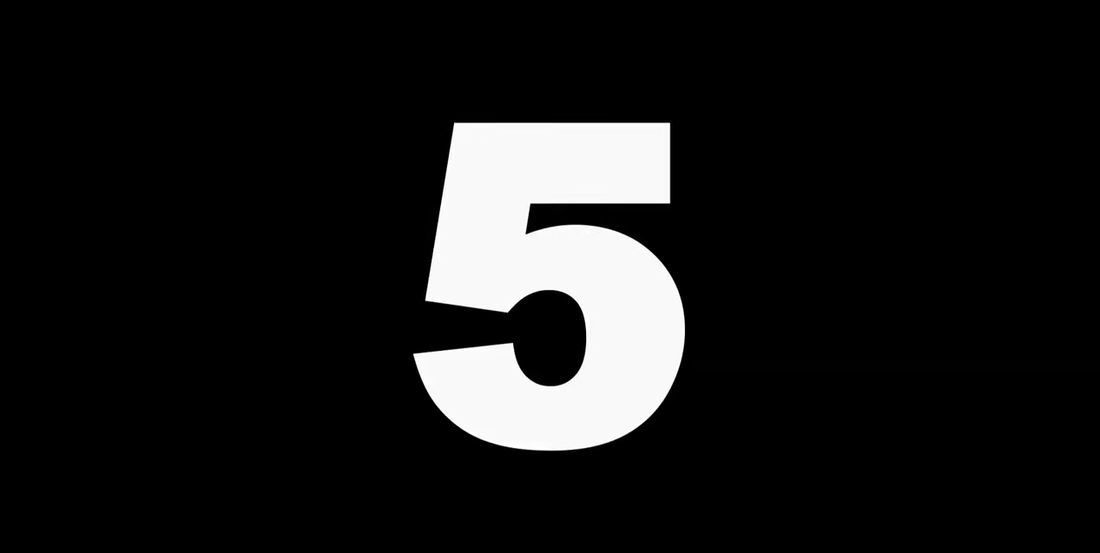
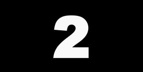
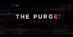
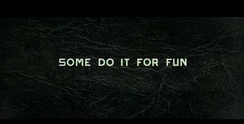
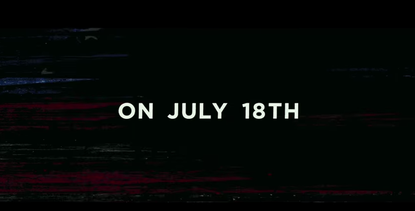
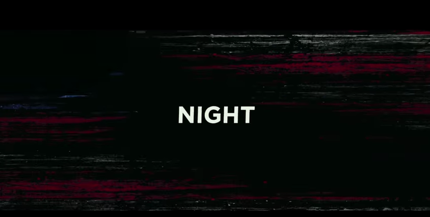
The Purge: Anarchy (2014)
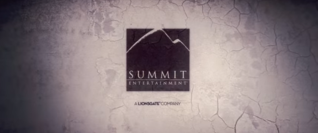
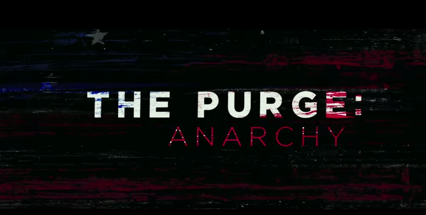
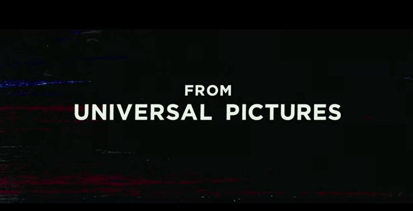
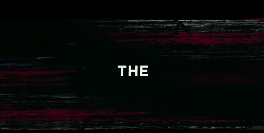
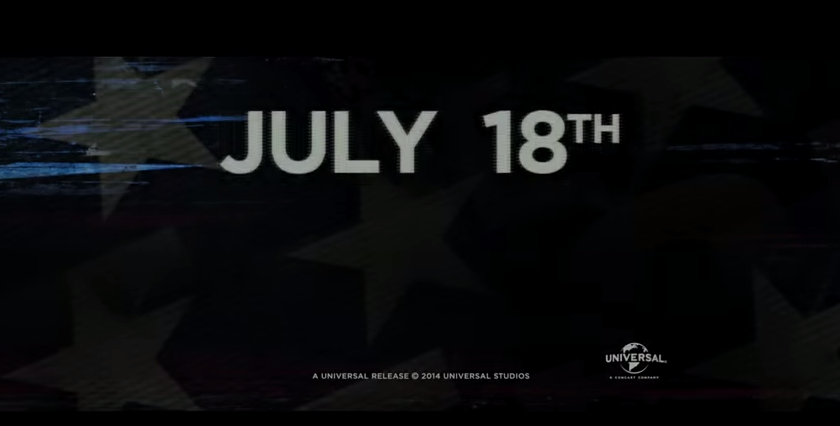
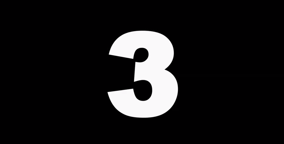
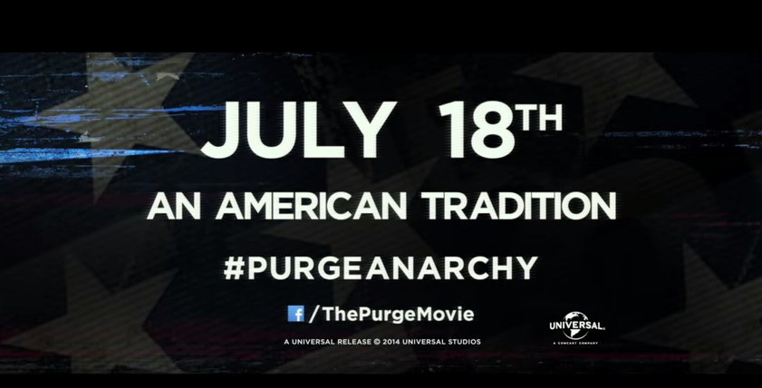
The Purge Anarchy trailer is 2 minutes 40 seconds and has 19 title shots all together. The first 5 pages have a solid black background with a countdown from 5-1, the numbers are white and are in bold writing, these are plain and simple but very effective because both colours contrast. Unlike the rest of the trailers The Purge Anarchy presents the title twice, once at the beginning and one towards the end. Universal is shown on he 7th title shot, this suggests that it distributed and produced the trailer as it is such a big company. Dark backgrounds continue for the last 12 title shot pages with solid, bold and white writing.
The Purge Anarchy trailer is 2 minutes 40 seconds and has 19 title shots all together. The first 5 pages have a solid black background with a countdown from 5-1, the numbers are white and are in bold writing, these are plain and simple but very effective because both colours contrast. Unlike the rest of the trailers The Purge Anarchy presents the title twice, once at the beginning and one towards the end. Universal is shown on he 7th title shot, this suggests that it distributed and produced the trailer as it is such a big company. Dark backgrounds continue for the last 12 title shot pages with solid, bold and white writing.
1. 0.00
4. 0.02
7. 0.21
10. 0.43
13. 1.52
16. 2.23
19. 2.33
|
2. 0.01
5. 0.03
8. 0.31
11. 1.19
14. 1.57
17. 2.26
|
3. 0.02
6. 0.04
9. 0.36
12. 1.47
15. 2.00
18. 2.27
|
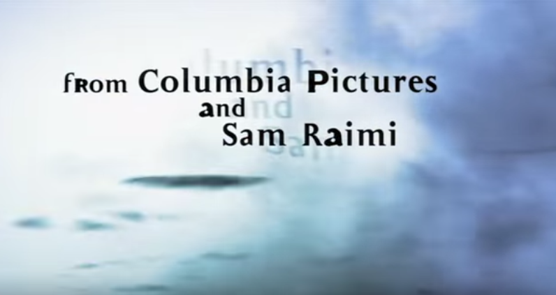
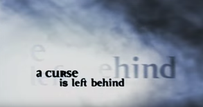
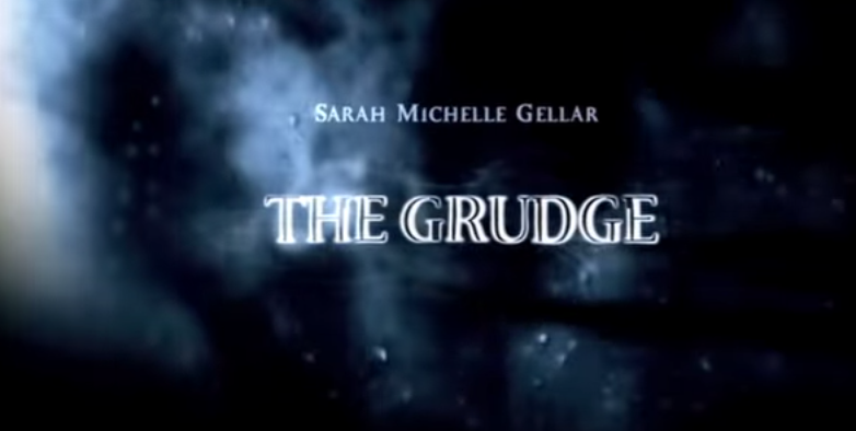
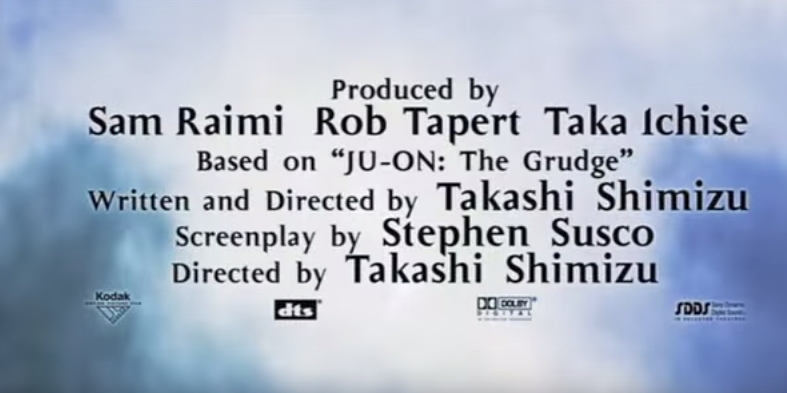
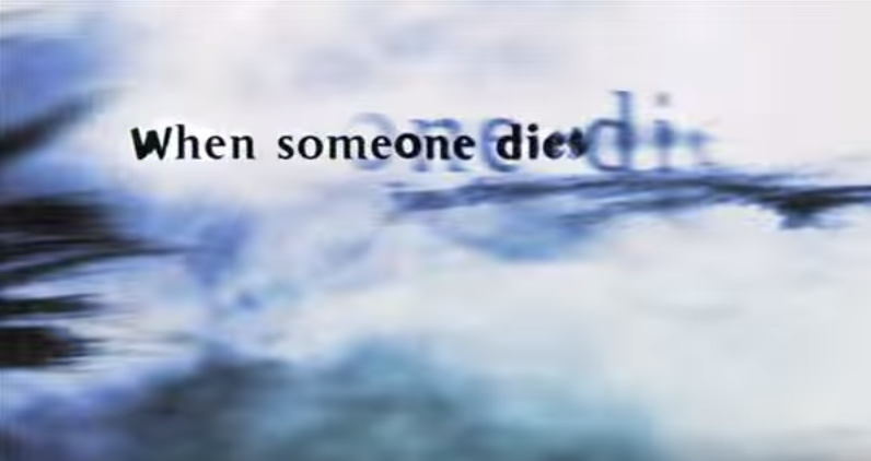
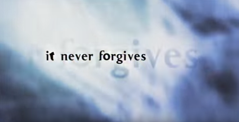
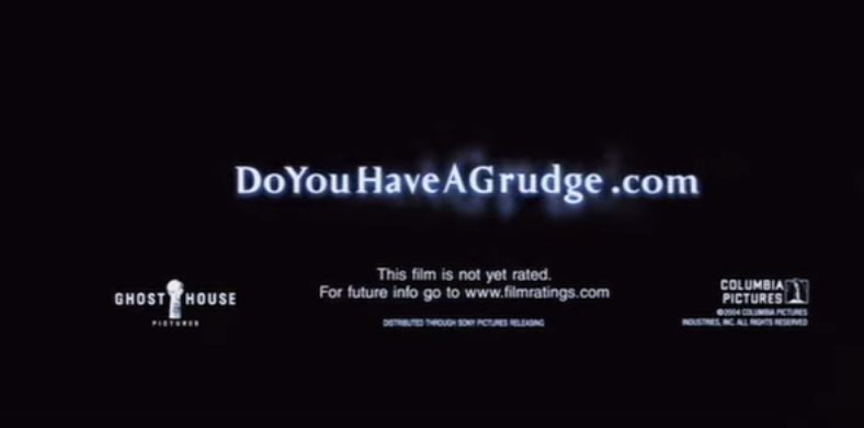
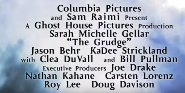
The Grudge (2004)
This trailer comes to 1 minute 26 seconds which is the shortest trailer out of all the ones we've chosen and has the less title shot pages. These title shots are different to the rest because the backgrounds use the grudges hair waving across the page with a white and blue back drop. The writing is black and follows the hair when coming in and then waves back out again, this is for 6 out of 10 shots. The next one shows more hair which still moves and covers more of the screen so white writing is used to present the title in bold, this contrasts with the back ground making it stand out. Title shot 8 shows a black background with white writing entering the page like the black wavy hair. The last time 2 shots come in with the wavy effort again, which white background and blue smoke moving on the outside of the page. These titles used by The Grudge are very repetitive but not many are used so it looks very creative and affective.
This trailer comes to 1 minute 26 seconds which is the shortest trailer out of all the ones we've chosen and has the less title shot pages. These title shots are different to the rest because the backgrounds use the grudges hair waving across the page with a white and blue back drop. The writing is black and follows the hair when coming in and then waves back out again, this is for 6 out of 10 shots. The next one shows more hair which still moves and covers more of the screen so white writing is used to present the title in bold, this contrasts with the back ground making it stand out. Title shot 8 shows a black background with white writing entering the page like the black wavy hair. The last time 2 shots come in with the wavy effort again, which white background and blue smoke moving on the outside of the page. These titles used by The Grudge are very repetitive but not many are used so it looks very creative and affective.
1. 0.08
4. 0.32
7. 1.15
10.1.23
|
2. 0.20
5. 0.51
8. 1.20
|
3. 0.22
6. 0.59
9. 1.22
|
